Adapt gradually
Read the transition from daylight to covered threshold to basement as one sequence.
Below ground, lighting does more than reveal surfaces. It helps a driver recognise an opening, read a change in direction and connect a parking bay to the way back out.
A design-reading guide, not a lighting calculation or compliance assessment.
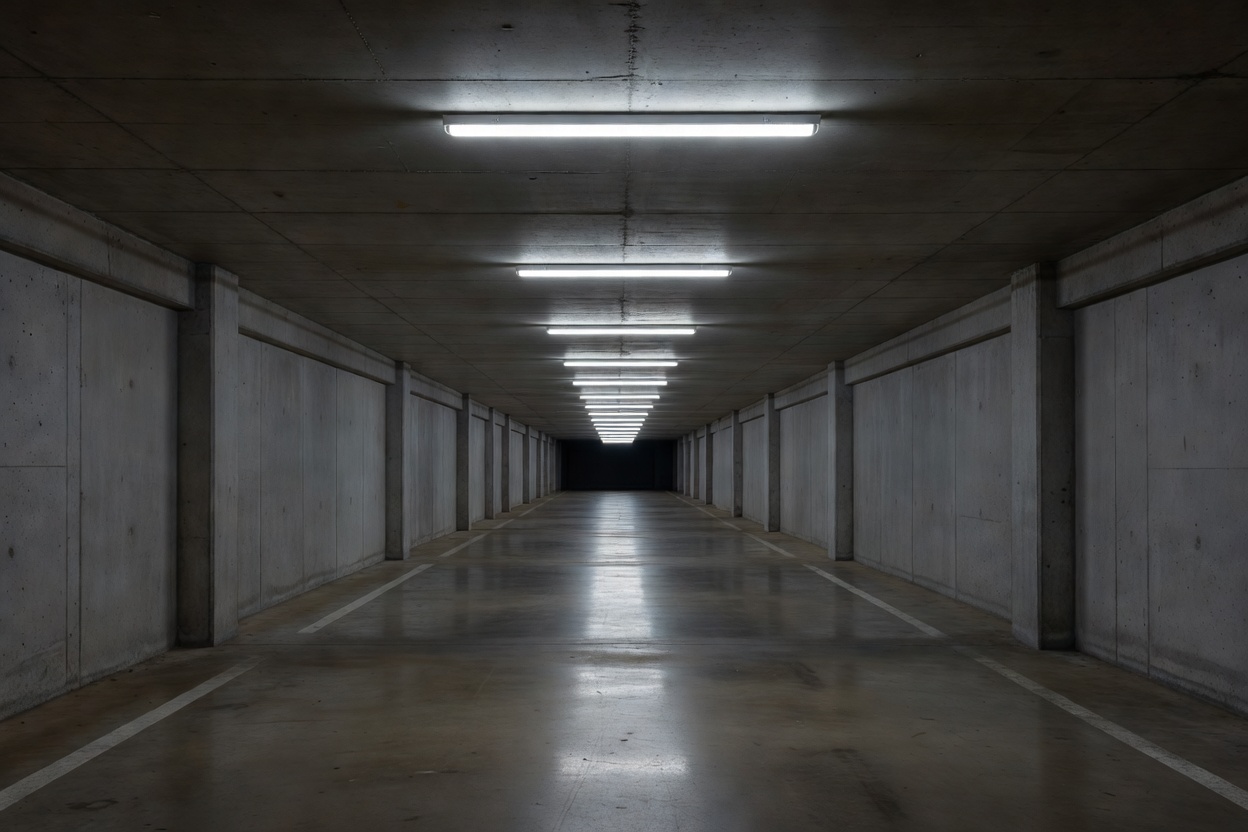
The first perceptual challenge often happens before the driver reaches the parking level. Eyes adapt as daylight gives way to a covered entrance and then to a deeper, more controlled interior. A sequence that changes abruptly can feel difficult to read, especially when the vehicle is moving and the driver is scanning for pedestrians, signs, barriers and the ramp edge. Designers consider the approach as a continuous experience rather than treating the basement as a room that begins at the property line.
Brightness, contrast, surface reflectance, glare and visual adaptation interact. More light is not automatically more legible: a bright fitting in the field of view can create discomfort, while a uniformly lit space may lack visual hierarchy. The design question is what needs to be seen at each point. A driver approaching a bend needs a clear view of the route and its boundaries. A pedestrian needs to recognise a safe path. Someone returning to a parked vehicle needs to identify the level and nearby core.
Lighting layouts can echo circulation. A continuous line may suggest direction; a change in pattern can mark a threshold or junction. These cues work best when they support the architectural plan rather than compete with signs and road markings. Repetition gives a driver a stable visual rhythm, while a deliberate variation can signal a real change in condition. If every zone has a different visual effect, however, the garage can become noisy and difficult to remember. A restrained vocabulary is often more useful than decorative complexity.
Architects and lighting designers can map decision points alongside luminaires: entry, ramp transition, junction, pedestrian crossing, lift lobby, stair and exit. For each point, consider what should be visible from the preceding position. A sign hidden behind a beam is a placement problem; a sign that appears only after a turn is a sequence problem. The same is true of light. It should help reveal the space soon enough for a person to understand what comes next, while remaining coordinated with ceilings, services, structure and fire-safety systems.
Colour and contrast can distinguish floors, parking zones or pedestrian routes, but they should be used with consistency. A simple floor identity repeated in signs, lift lobbies and navigation cues is more memorable than a palette that changes from one surface to another. Contrast also matters at edges, level changes, doors and columns. Material finishes, line markings and illumination can reinforce these elements, but a visual device should not be mistaken for a physical safety measure or a substitute for required accessibility provisions.
Accessible wayfinding needs to be considered across different users and conditions. The route should not rely on one kind of cue alone. People may not see a colour difference, may be unfamiliar with a graphic code or may encounter glare that changes how a surface reads. Clear text, consistent naming, tactile information where appropriate and an understandable spatial sequence can complement one another. Project teams should consult relevant accessibility guidance and the regulations applicable to the location. In the UK, Approved Document M is one reference for inclusive access in buildings.
A garage is used in two directions: driving in and walking out, then walking back and driving away. The return journey can feel unlike the arrival. A driver may remember a bay’s number but not its level; a visitor may leave by a different stair; a lift lobby may look similar on every floor. Distinctive yet calm landmarks can help people orient themselves. These might include a visible core, a repeated graphic system, a change in ceiling rhythm or an identified view toward the exit—not necessarily a decorative object.
Test the view from real positions rather than relying solely on a plan. A driver seated in a vehicle sees different angles and obstructions from someone standing in the aisle. A column can block a sign; a parked vehicle can conceal a painted wall cue. A light fitting can reflect in a wet floor. A wayfinding scheme should be reviewed at decision points and in the expected operational conditions, including the possibility that some bays or signs are temporarily obscured.
Fixtures compete for space with ducts, pipes, sprinklers, signs, beams and maintenance access. A reflected ceiling plan should tell a coherent story about all of them. Long linear fittings can emphasise direction and repeat across a bay, while compact fixtures can respond to tighter geometry. The arrangement affects shadows, visual rhythm, servicing and energy use. The correct fixture, output and spacing depend on calculations, mounting conditions and applicable standards; general photographs or online examples cannot supply project-ready specifications.
Standards such as BS EN 12464-1 address lighting of indoor work places, while BS 5489-1 provides guidance on road lighting; their scope and relevance must be checked by qualified professionals for a particular garage. A parking structure is not simply a workplace or a public road, and the design team must identify the applicable requirements. Lighting controls also affect experience: presence detection, daylight response and operating schedules should be coordinated with safety, maintenance and user expectations.
Built work shows that light belongs to context. A civic garage in a dense city may rely on a controlled threshold; an open-sided car park may receive changing daylight; a subterranean garage beneath a landscape has different opportunities again. The Tønsberg Parking Garage by Reiulf Ramstad Arkitekter, Seattle Central Library’s parking facilities associated with the OMA and LMN design teams, and Boston Common Garage are useful prompts for comparing urban placement and circulation. Published images can show spatial character, but rarely communicate measured light levels, control sequences or maintenance performance.
A useful study records the journey in a sequence of views: street approach, entry, descent, parking aisle, pedestrian path and exit. Sketch the visible cues in each frame, then ask whether the sequence tells a consistent story. Note where contrast is helping, where glare may intrude and where a sign or core disappears. This makes design discussion specific without pretending that an aesthetic preference is a technical validation.
Light and wayfinding are most successful when they reinforce a route that already makes spatial sense. The plan provides the order; the visual system makes that order easier to perceive. When a lighting change, level name or landmark is introduced, it should clarify an actual decision. The result is not merely a brighter garage but a place where a driver or pedestrian can understand where they are, what lies ahead and how to return to the street.
Stand at each turn and trace the visible route, sign, boundary and destination. Then repeat the exercise on foot from the bay.
Continue to structure →Read the transition from daylight to covered threshold to basement as one sequence.
Use consistent lighting and graphics to clarify turns, crossings and destinations.
Repeat level identities and visible landmarks through the walking route.
About cookies Some cookies are needed for the site to work. Others help us understand how it is used. You can change your choice later. More about cookies